
Do you have trouble committing?
Not to a person⸺to a paint color.
You’re likely suffering from paint paralysis.
Yes, it’s real!
It happens to me every time I try to pick the perfect shade of gray.
Who knew there’s a psychological condition that causes you to fear getting a paint color wrong?
Let’s be real here⸺gray is tricky.
And picking the wrong shade can deliver less-than-perfect results.
That’s why I’m crazy about Sherwin Williams Crushed Ice (SW 7647).
Follow me into the world of a soft neutral gray that goes anywhere!
This is one gray that deserves a minute of your attention.
I guarantee you’ll fall in love.
You might even commit to painting more than one room in this sleek, timeless color.

What You Should Know About Crushed Ice
If you’re like me, you hear the word “warm” and you think of beige or cream colored paint.
Crushed Ice is far from beige, and it’s not a creamy white either.
What comes to your mind when you see a paint color with the word “ice” in it?
I imagine a cool, stormy shade of, well, gray.
So, while this paint color isn’t technically cool, on the wall, (and depending on the light) it does remind me of a stormy afternoon.
If you like a little mystery, you’ll love how the warmth in Crush Ice isn’t obvious.
To me, it’s white without being white.
If your home needs a warm, fresh color palette, I vote for this soft, neutral gray.
Crushed Ice Technical Characteristics
There’s nothing more frustrating than falling head over heels with a paint color and finding out it doesn’t look anything like the picture you had in your mind.
Maybe it looks lighter than expected.
Or perhaps it’s much darker.
Blame it on LRV (Light Reflectance Value).
Light affects and defines every color!
And every paint color has an LRV that helps you predict how dark or light the color appears on the wall.
With an LRV of 66, Crushed Ice fits almost directly in the middle of the LRV spectrum (100 is pure white).
In a bright room, our soft neutral color reflects a LOT of light.
How does that work?
The walls have a significant amount of light to play with, and this paint color loves to reflect light.
The higher the LRV, the more light your paint color will bounce back at you.
Don’t forget the other technical details for SW Crushed Ice⸺RGB (red, green, blue) and HEX values:
- R: 214
- G: 211
- B: 204
- Hex Value: #d6d3cc

Sherwin Williams prints the LRV for all their paint colors on the back of the fan deck.
How Will Crushed Ice Make Your Home Feel?
So many things to love about Crushed Ice, but if I had to choose a favorite trait, I’d say I love its versatility best.
Most neutral paint colors have a white base and an undertone.
Because of where it sits on the color wheel (99°), this neutral often displays a green undertone.
Often, but not always.
Keeping in mind that light means everything for a paint color, with the right lighting, you may pick up on slightly blue and even violet undertones.
Here’s where its versatility plays center stage.
Choosing SW Crushed Ice means you’re giving each room where you use it a clean canvas.
In essence, using combinations of natural and artificial lighting, colors and textures in fabrics, and finishes such as flooring and cabinetry, you control how this color behaves on the wall.
It helps if you know before you paint what mood you want to create.
Tweak the room to bring out the green undertones and the room will feel calming and balanced.
When the blue undertones prevail, your room may have a soothing, tranquil ambiance.
Tap into the violet undertones, and create a space where people feel calm and uplifted.
Tip: Be careful when working with purple undertones in a paint color⸺you might get a shot of negative drama you weren’t counting on.
The Effects of Lighting on Crushed Ice
Now, don’t get me wrong, I have a deep respect for the social sciences, but when I’m picking the perfect paint color, I favor the theory of light over psychology.
Ready for a bit of a lighting roller coaster ride?
If you use Crushed Ice in a room with cool northern light, you tease out the cool undertones.
Watch this color soften under the influence of a western-facing room in afternoon light.
The warmth will feel quite subtle, but it’s there.
Too much natural light makes our soft neutral look washed out.
But…
If the room doesn’t get any natural light and you’re not strategic with your artificial lighting, you may end up with a paint color that looks dingy on your walls.
You can counter that by adding depth to the color.
Paint the ceiling and trim a clean, crisp white like Sherwin Williams Extra White (SW 7006).
I mentioned a lack of commitment at the beginning of this article.
Many true gray colors are totally committed to their undertones.
Not this gray!
The flexible undertones are what makes this color so versatile.
You’re not limited by its undertones.
What happens then, when you get Crushed Ice on the wall and realize it doesn’t quite fit in the way you’d planned?
Lighting to the rescue!
You can change the way a paint color isn’t working by switching light bulbs.
Try bulbs with either warmer or cooler tones.
Expert tip: Try before you buy with a peel and stick paint sample.
I recommend Samplize.
Stick the sample on the wall in various places around the room and gauge how your color will interact with your lighting elements and decor.
Other Similar Colors to Consider
Decorating your home is all about choices, and when selecting the ideal paint colors, you have many.
Keep things simple and put just 2-3 colors side-by-side while working through the selection process.
I’m attracted to two shades that share similar traits with our warm gray.
Crushed Ice vs Benjamin Moore Moonshine

When I look at Crushed Ice next to Moonshine, what strikes me is the sneaky undertones in CI vs. the subtle but obvious blue/green undertones in Moonshine.
With an LRV of 67, Moonshine is slightly more reflective than Crushed Ice. It’s also a cool, rather than warm neutral gray.
In most rooms, Moonshine comes off as a pale gray, while SW CI is a stunning warm gray.
Crushed Ice vs Sherwin Williams Big Chill

Big Chill is another gray neutral but it’s a cool neutral with soft blue undertones.
It has a significantly lower LRV (62) than our favorite warm neutral gray.
If you use Big Chill in a room with sun-facing windows, you may not experience the same level of color wash out that you might when using Crushed Ice.
In the kitchen, I like warmth, so, if you have warm white quartz countertops, especially if they have a bit of gold and beige veining, paint the cabinets with CI.
White marble and blue veins?
Big Chill is a no-go.
What Colors to Coordinate with Crushed Ice
The fun part of choosing SW Crushed Ice for your blank canvas is the nearly endless colors you can pair with it.
Monochromatic Color Palette

- SW Crushed Ice
- SW Pure White
- SW Functional Gray
View this post on Instagram
There’s nothing boring about this farmhouse-style half bath.
SW Crushed Ice makes the perfect backdrop for the other two neutrals.
SW Functional Gray brings the vanity to center stage.
The shiplap and trim done up in SW Pure White wrap up the show.
Dramatic Color Palette

- SW Crushed Ice
- SW Iron Ore
- SW Scanda
- SW Extra White
It’s an Oscar-worthy performance performed by four Sherwin Williams paint colors.
What works in this color scheme is subtlety.
First, you have the subtle blue undertones of Crushed Ice.
Add in the SW Scanda soft blue and slightly cool undertones found in Extra White, which this designer used for the trim.
Top the trio off with Iron Ore’s dark, deep charcoal gray and you have a winner!
View this post on Instagram
When you think about colors to pair with a warm, neutral gray, think about the mood you want to create.
Consider how your flooring, fixtures, and furniture can all play together to draw out either the blue/greens or the violet undertones in Crushed Ice.
Dark flooring will bring out the deeper warmth in this paint.
You can counteract that, if you wish, by using a bright white on trim and doors.
Because you’re working with a neutral gray, splashes of jewel-tones in fabrics and accent pieces help to steer this color in the direction you want it to go.
Best Places to Use Crushed Ice in Your Home
I have no problem recommending Sherwin Williams Crushed Ice in any room where you want a warm, sleek look.
Here are a few ideas to inspire you!
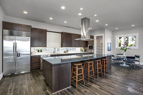
Modern Kitchen
Notice how the dark wood in the cabinetry and flooring pulls in the blue-violet undertones.
Artificial and natural light create a balance.
Living Room
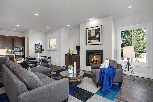
It’s an easy transition from kitchen to living space in this open-concept modern home with a little help from our soft gray paint color.
The jewel-tone blue accents offer an exciting pop of color.
Bedroom
View this post on Instagram
Can’t think of a more magical way to brighten a dreary guest room.
A few soft elements like the gray checks in the bed linens and the subtle blue-gray throw pillows pull the eyes in without distracting.
Bathroom
The perfect example of how ample natural light balanced with artificial lighting bring out the warmth in a neutral gray paint.
There’s no washout here!
You’re wondering if SW Crushed Ice makes a good exterior paint color, right?
While I’m not totally against it, colors with higher LRVs can look washed out, particularly if your home receives a lot of sun on the front.
If you decide to use CI on the exterior, make sure to pair it with a crisp white trim color for contrast.
Experience for Yourself the Warmth of Sherwin Williams Crushed Ice
I tend to go with my heart rather than the trends, but I’m convinced gray is here to stay.
And if it’s a warm, neutral gray like Sherwin Williams Crushed Ice, there’s a permanent place for it in my paint color journal.
If you’re looking for a subtle way to work gray into a room where you want the temperature soft, warm, and neutral, let Crushed Ice headline the show.