You love the calming vibe in a room with white or light gray walls but lately, you feel like you need more depth in your home.
You could add a little spice to a room by sprucing up a side table or a chair with a darker, stand-out paint shade.
If I wanted to make a bold statement, I might color the walls in a dark, neutral shade of gray.
It’s easy to shy away from dark paint colors.
After all, if you make a mistake, it takes a little more effort to cover it up.
Don’t be afraid of mistakes!
View this post on Instagram
I’m going to show you how to use a modern, smoky gray neutral with confidence.
It’s a deep, dramatic color that can look lovely anywhere⸺inside or outside⸺with a few caveats that I’ll cover below.
I can almost guarantee you’ll fall hard for Sherwin Williams Peppercorn after reading this color guide.
Peppercorn Technical Characteristics

When you work with neutral paint colors, there’s always potential for the color to look darker or lighter than expected.
To find out why that happens, you’ll want to know more about your color’s Light Reflectance Value (LRV).
LRV helps predict how dark or light different colors look on the wall.
The LRV scale runs from 0% (black) to 100% (pure white).
With an LRV of 10, Peppercorn is almost (but not quite) black and it absorbs more light than it reflects.
When working with a dark neutral paint color, too much natural light can wash out the color.
I was a little surprised to learn that this color has equal amounts of red, green, and blue.
Here’s the RGB values:
R:88
G:88
B:88
And the Hex value: #585858
These values matter if you’re sampling paint colors from other manufacturers.
Having the RGB and Hex values handy will help a paint specialist custom mix your desired color.
If you’re using the Sherwin Williams brand, the color tech can adjust RGB values to lighten or darken the color a tinge.
You’ll notice Peppercorn is part of the Sherwin Williams Purely Refined color collection.
And in their words, “true luxury doesn’t shout its presence with glitz, glamour, and bling.”
Understated, subtle, and refined all describe the characteristics of this neutral paint color.
It’s easy to see why Sherwin Williams included it in this particular color collection.
View this post on Instagram
How Will Peppercorn Make Your Home Feel?
One thing I love about this color is that it won’t blindside you once you get the paint on the wall.
It’s a dark gray without any obvious undertones.
I say obvious because certain lighting (which I’ll talk about next) can bring out a subtle hint of purple or blue.
If you love a rich, dark, and moody color in your home, Peppercorn could be the perfect choice.
I’ve seen home decorators use this color on a feature wall.
It can look stunning when surrounded by a warm, creamy white on the ceiling and trim.
Should you cover the ceiling and trim in the same shade of white?
I prefer a brighter white for trim and a more muted white for the ceiling.
As an all-over paint color, I think you would be entering the danger zone of overdoing a good thing.
You may stumble into an overwhelming and dramatic mood that you didn’t order.
The Effects of Lighting on Peppercorn
Earlier, I promised to talk about lighting and how certain lighting situations might bring out the very subtle blue or purple undertones in this paint.
The hue value of this color places it in the purple color family, where it sits directly in the middle between warm and cool.
Peppercorn leans cool.
Using it In a north-facing room, where light tends to be cooler, helps bring out its best traits.
I caution against using this paint color in rooms where warmer natural light is prevalent (east, west, and south-facing).
You may not get the smoky gray color I adore.
In a room with constantly changing light, the color will look a bit lighter, and more purple than gray.
That doesn’t forbid you from using a dark neutral in anything other than a north-facing space, but you do need to proceed with caution.
Try the color on a feature wall rather than rolling it out over the entire room.
Here’s a tip on trying out a color:
Samplize offers a fantastic stick-on paint sample that you can stick on the wall.
It’s a whole different twist on paint sampling!
Now, back to the light!
In a room with abundant natural light, the paint could look like a creamy purple rather than the soft, refined gray most people love.
In a dark space, you may notice the paint color looks inky-blue instead of dark gray.
I like to use the magic of artificial lighting to bring out the beauty in dark neutral paint colors.
However, the right type of lightbulbs make a difference.
Cool white LEDs between 3500K to 4000K are better suited to dark neutral grays like this one.
View this post on Instagram
Other Similar Colors to Consider
Sometimes, I feel overwhelmed by so many decor choices⸺I’d rather just pick something and get the job done.
Where is the fun in that?
You can put the joy back in picking the right paint colors if you keep things simple.
Narrowing selections down to only 2-3 removes much of the work involved with making decisions about paint.
I narrowed it down to two similar grays to compare with my dark gray color.
Peppercorn vs Behr Asphalt Gray

With an LRV of 11, Asphalt Gray is a touch lighter, but it also has blue undertones.
From a distance, the two colors look similar, but when you place them next to each other, you can clearly see the blue undertones in the Behr color.
It’s more of a challenge for me to work with dark neutrals when they have blue undertones.
It’s more about the lighting in my home.
The last house I renovated had more west and east-facing windows.
While I loved the idea of a smoky neutral, I chose a greige instead.
Peppercorn vs. Sherwin Williams Iron Ore

I’ve noticed several people comparing these two paint colors.
Here’s what I think:
In my home, we try to keep the drama to a minimum, and Iron Ore delivers a bit much for the spaces I have to work with.
I do love the darker color because it’s a true dark gray⸺no undertones to worry about.
Iron Ore also has an LRV of 6 (gasp!) and that makes it really close to black.
But…
I choose Peppercorn because it lets me be a little sassy without overwhelming my small spaces and minimalist style.
What Colors to Coordinate with Peppercorn
Because it’s a dark neutral, you gain a lot of freedom when choosing coordinating colors.
Here’s a few examples of using different shades to bring out the beauty in Peppercorn.
Contrasting Color Palette
- SW Agreeable Gray
- SW Peppercorn
- SW Snowbound
Snowbound for the trim color keeps the clean, elegant theme. The light oak flooring adds a splash of color.
View this post on Instagram
Neutral Palette with an Accent Color
- SW Windfresh White
- SW Olympus White
- SW Willow Tree
You can get away with not using an accent color in a neutral color palette, but you’ll need to create contrast somewhere.
I do that when I select flooring, countertops, and tile.
In a kitchen or bathroom, I suggest white cabinetry and white countertops.
Clean and simple.
You might also consider white marble countertops with a smidge of gray veining.
Best Places to Use Peppercorn in Your Home
In most spaces, you can make a light neutral paint color work by adjusting lighting and other details like accent colors and textures.
Dark neutrals play differently.
I advise taking inventory of your home and determining whether you have room for this dark paint color.
While I’ve seen it used as the primary wall color in living spaces, you do need to be careful about overwhelming the room.
If your decorating theme includes a lot of wall art, heavy furnishings, and dark floors, you may need to reconsider.
Or, go on a shopping spree and update to the slim, sleek lines of a modern design scheme.
Also, it might seem like you shouldn’t use dark neutrals in tiny spaces.
You could pull off the darker color in a powder room if you tempered it with a lot of white.
Here’s how I would use Peppercorn in my home.
Home Office
View this post on Instagram
This designer chose the all-over dark gray look, and it works here.
But…
only because of the blues in the rug and the use of color in the other room accents.
Exterior
View this post on Instagram
I’m absolutely smitten with the way this homeowner uses Peppercorn as an accent on the shutters and front door.
It’s nestled comfortably in SW Oyster white and SW Retreat.
Kitchen
I know you’ll fall in love with this kitchen! I sure did!
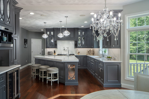
Look how they use the natural light and artificial light to soften the dark gray.
White countertops, trim, and furnishings drive coherence.
Tip: I’m not a fan of the red in the wood flooring, and would have chosen a light oak.
Bathroom
View this post on Instagram
Peppercorn and SW Pure White come together in the perfect marriage in this bathroom.
The gold mirrors and brass hardware are just the icing on the cake.
Enjoy the Bold Side of Home Decor with Sherwin Williams Peppercorn
By paying close attention to lighting, room size, and the other components of your design scheme, there’s no reason not to go with a dark neutral like Sherwin Williams Peppercorn.
I challenge you to make room in your home for this refined and understated paint color.
You’ll love the results!