Easy on the eyes and good for the spirit, Retreat is a hidden gem with lots of potential.
People usually steer clear of dark sage walls, in fear that it’ll make a space dull and congested.
That’s not the case with Sherwin Williams Retreat SW 6207 – at least, not if done right.
This paint color is a mid-warm sage green paint color with deep gray undertones.
It exudes a sense of sophistication, grace, and tranquility—perfect for a busy, working family.
Plus, it works well in almost every area of the home, including the kitchens, the bedroom, and even the exterior!
In this article, I’ll show you how to unlock the true potential of this gorgeous sage paint.
Here we go!
Retreat Technical Characteristics
Soothing, sophisticated, and sincere, the SW Retreat is a lovely moody green color with deep gray undertones.
Its deep richness anchors a room without taking the center stage.
With a Light Reflective Value of 21, Retreat falls on the darker end of the spectrum.
This means that, unlike colors above LRV 50, this deep green-gray color soaks up more light than it reflects.
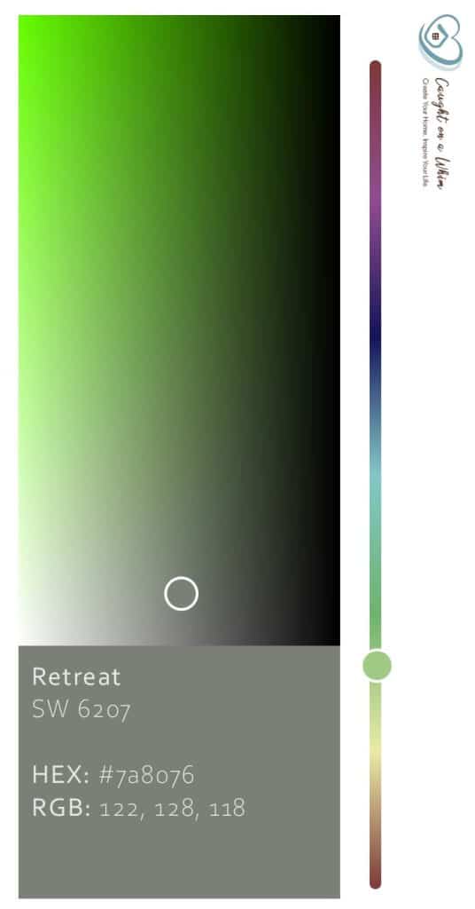
Other associated terminologies are as follows:
- HEX Value: #7a8076
- RGB: Red = 122, Green = 128, Blue = 118
- CMYK: 4.69, 0.00, 7.81, 49.80
How Will Retreat Make Your Home Feel?
This is one color that is full of personality. It’s calm, soothing, and sophisticated.
After a long, hard day at work, you’ll appreciate the tranquility it exudes. It has an irresistibly inviting, weathered familiarity that instantly makes a space intimate.
Without the right pieces to accompany it, though, it’ll weigh a room down.
Due to its low reflectivity, it has a tendency to make large areas feel smaller.
Its dark hue makes art and other objects against the walls stand out, so it’s a brilliant color in a room that has a lot of stuff going on.
For small spaces, Retreat works better as an accent. Pair it with browns and stark whites over LRV 82 and watch the room come to life.
View this post on Instagram
The Effects of Lighting on Retreat
This gray-green reacts dramatically under certain light conditions.
It feels cool and crisp in north and south-facing rooms, and warm and gentle in east and west-facing rooms.
Standard soft white incandescent or LED light bulbs make it appear bright but dull, while vintage “Edison” bulbs add a warm, almost amber tinge to the color.
Fluorescent lights make Retreat appear cooler and bolder.
In a poorly lit room, Retreat loses some of its lovely dark green color, leaving it to appear dark gray and sometimes even black at times.
View this post on Instagram
Other Similar Colors to Consider
I have to say that this is one of my favorite green grays out there, but there are other similar shades you can choose from to find the perfect green-gray for your home.
Retreat vs. Attitude Gray (SW 7060)
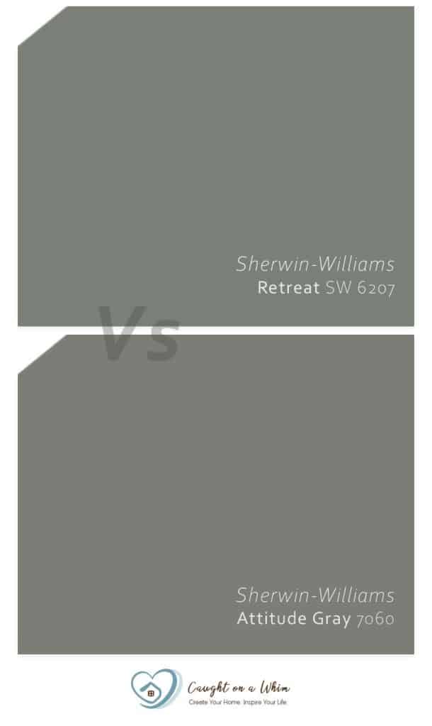
With an LRV of 20, Attitude Gray is just a smidge darker than Retreat.
They have a similar vibe, except Attitude Gray appears light gray in the light whereas our star color appears muddish green.
Attitude Gray is best paired with creamy whites to create that perfect balance of dark and light.
Its technical specs are as follows:
- HEX Code: #7C7D75
- RGB Decimal: 124, 125, 117
- CMYK Percentage: 1, 0, 6, 51
Retreat vs Link Gray (SW 6200)
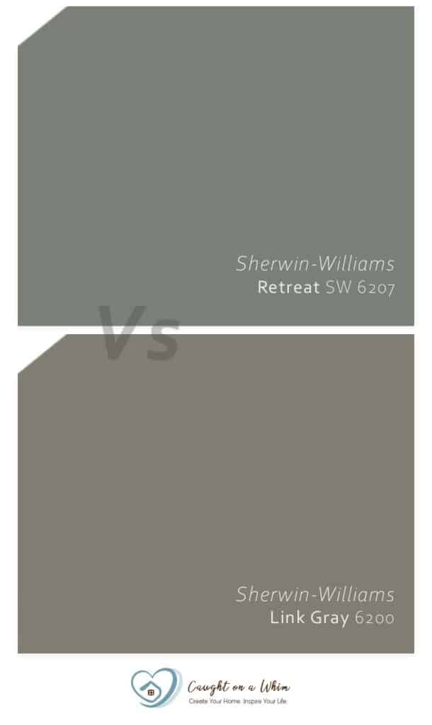
Link Gray falls more on the traditional side of gray.
It’s darker than Retreat with an LRV of 21, so be wary when using it in smaller spaces.
It pairs extremely well with lighter and warmer off-whites.
Patterned sheets, curtains, and throw pillows offset the standard gray appearance of Link Gray and add a bit of personality to a space.
Its technical specs are as follows:
- HEX Code: #7F7E72
- RGB Decimal: 127, 126, 114
- CMYK Percentage: 0, 1, 10, 50
Retreat vs Farrow and Ball Green Smoke (47)
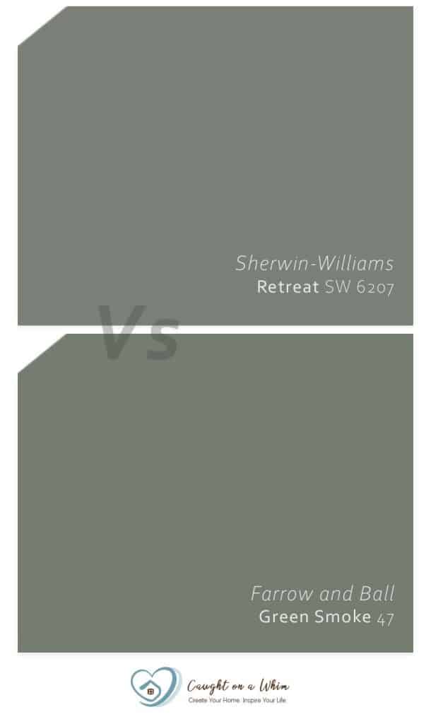
Green Smoke is one of Farrow and Ball’s most popular dark green colors.
In a month alone, this color received over 10,000 website searches, and to this day shows no signs of slowing down.
Green Smoke is a dusty green-blue color with gray undertones.
It’s darker than Retreat at 19 LRV, so it works well as a backdrop in large, spacious rooms or as an accent in small, cozy rooms.
It appears much warmer than the latter and gives off a stronger, nature vibe thanks to its deep camouflage-green color.
Its technical specs are as follows:
- HEX Code: #737C70
- RGB Decimal: 115, 124, 112
- CMYK Percentage: 7, 0, 10, 51
Retreat vs. Valspar Lush Sage (5003-2B)
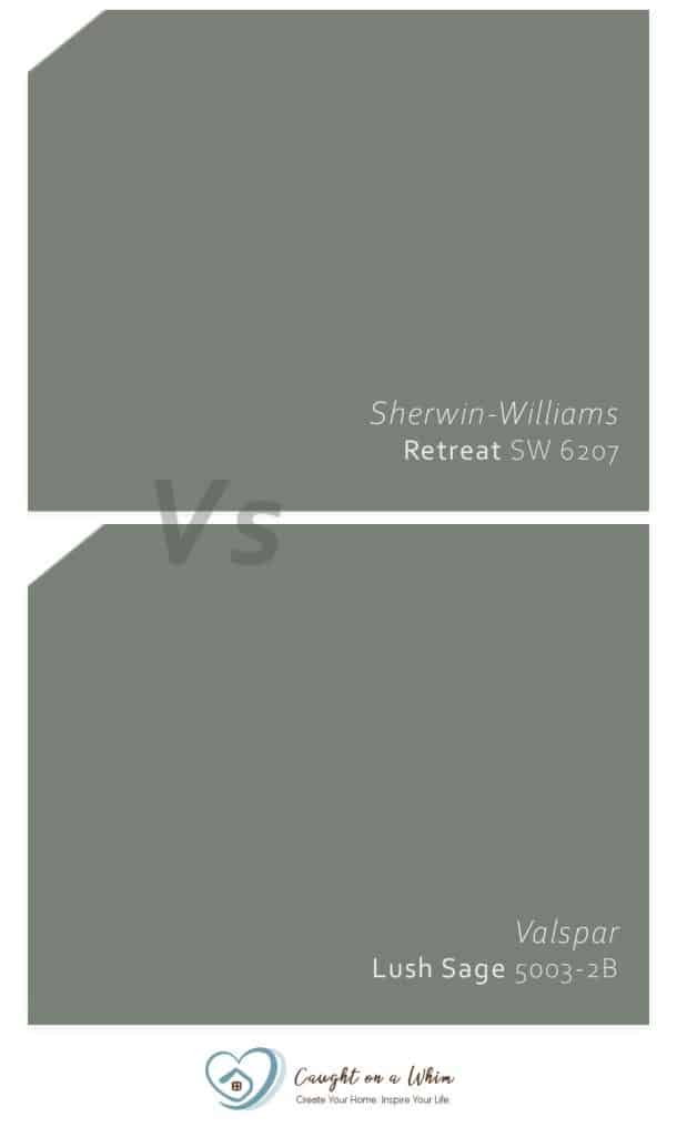
Lush Sage is perhaps the most visually similar alternative to Retreat. Even professionals can’t tell them apart sometimes! The difference is so subtle it’s barely even there.
Like Retreat, Lush Sage has an LRV of 21. They react similarly to light, except Retreat appears more grayish under natural light while Lush Sage appears green-blue.
Technical specs are as follows:
- HEX Code: #788176
- RGB Decimal: 120, 129, 118
- CMYK Percentage: 7, 0, 9, 49
What Colors to Coordinate with Retreat
Sherwin-Williams Retreat is a relatively beginner-friendly color. It pairs well with both light and dark color schemes as long as the colors you’ve picked have nicely balanced values.
Light Coordinating Colors
This soothing green color works brilliantly with lighter grays, creamy whites, crisp whites, and greiges.
Here’s what I suggest to make the green of Retreat truly pop:
- SW Origami White
- SW Spare White
- SW Verdigreen
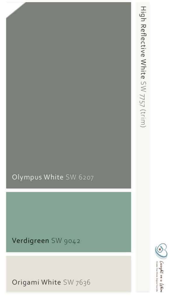
Origami White works well for ceilings, moldings, and trims. If you want a more crisp look, replace Origami White with SW High Reflective White or SW Extra White.
Verdigreen can be used as an accent, while Spare White can be applied on windows, railings, and bases.
If you’re going for a warmer vibe, use this palette:
- SW Alabaster
- SW Passive
- SW Alchemy
Monochromatic Coordinating Colors
If you want to go on full-monochrome, I recommend one of two palettes:
- SW Comfort Gray
- SW Oyster Bay
- SW Acacia Haze
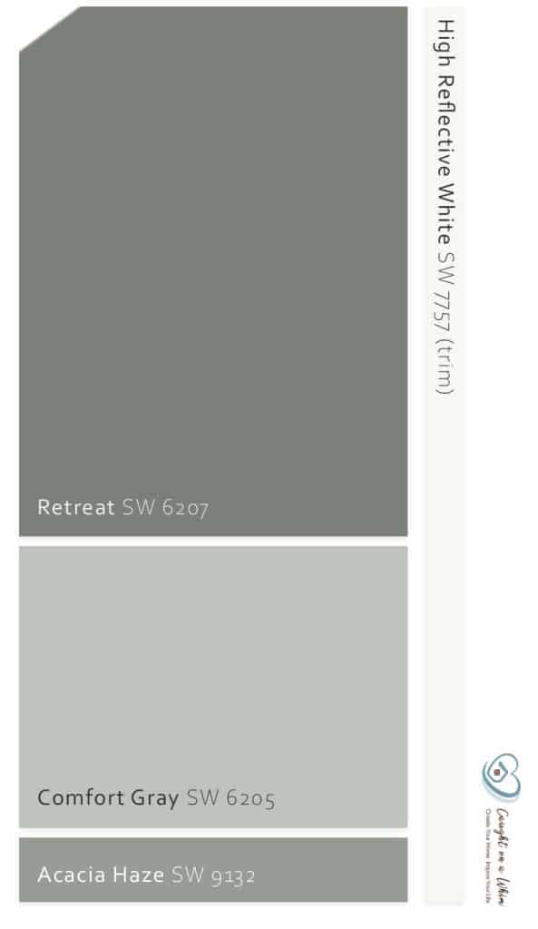
OR:
- SW Sea Salt
- SW Ripe Olive
- SW Comfort Gray
- SW Pewter Green
Dark Coordinating Colors
If you’re going for a mostly-green decor, these colors work nicely:
- SW Privilege Green
- SW Parisian Patina
- SW Connected Gray
For a bold pop of color, go with this scheme:
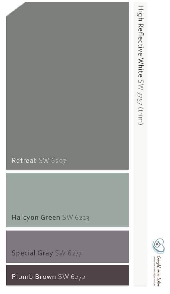 SW Halcyon Green
- SW Special Gray
- SW Plum Brown
You could also replace your deep color with the bit more neutral Peppercorn from Sherwin-Williams (love this one!).
Remember: when using a dark color scheme, follow the 60-30-10 rule: 60% for the main color, 30% for the complementary color, and 10% for the accent.
Best Places to Use SW Retreat in Your Home
Retreat is the color of harmony, abundance, and nature, so it quite literally goes anywhere.
Living room? Gorgeous.
Kitchen? Yes, please.
Bathroom? Ooh la la—exquisite!
Retreat goes especially well with themes such as traditional, contemporary, transitional, Bohemian, and coastal.
So if you’re going for any of those themes, this green will treat you well!
Kitchen
In the kitchen, you can use Retreat for cabinetry, trim, built-in shelving, accessories, and of course, the walls.
Its green-gray color adds a sophisticated and fresh feel to the kitchen space, especially when paired with creamy or marble white counters and wooden floors.
Bedroom
Retreat amps the elegance of a minimalistic room significantly.
Although it works well as the main backdrop of the room, I definitely recommend using it as an accent wall behind the headboard.
Elevate the color’s beauty even more by adding browns, greens, and whites to the room.
Examples include white bed sheets, brown or mustard yellow throw pillows and wall decor, brass-tinted fixtures, and green ornamental plants.
Keep the base neutral with creamy whites to further emphasize the dark green-gray color of Retreat.
Bathroom
Retreat is the color of rejuvenation: calming, centering, and invigorating. It can provide a moment of calm as you get ready for work or pamper yourself for bedtime.
Pair the dark sage green walls with beautiful creamy whites to create a stark contrast of cleanliness in the bathroom.
Throw in some mustard yellows and burnt brown accents to further emphasize the gentle color of this paint.
Living Room
View this post on Instagram
Whether as a backdrop or an accent wall, you can’t go wrong with sage green paint in your living room.
Since it’s such an organic shade—associated with nature, outdoors, and growth—it’s one of the best paint colors for living rooms.
For best results, pair it with wooden furniture, patterned white sofas, houndstooth chairs, and lots of greenery.
Conclusion
Sherwin Williams Retreat is a great gorgeous moody green paint with deep gray undertones. It works best with lighter grays, creamy whites, and greiges.
It also looks stunning with dark chocolate hues and forest greens.

